Spotify is ditching the hamburger menu
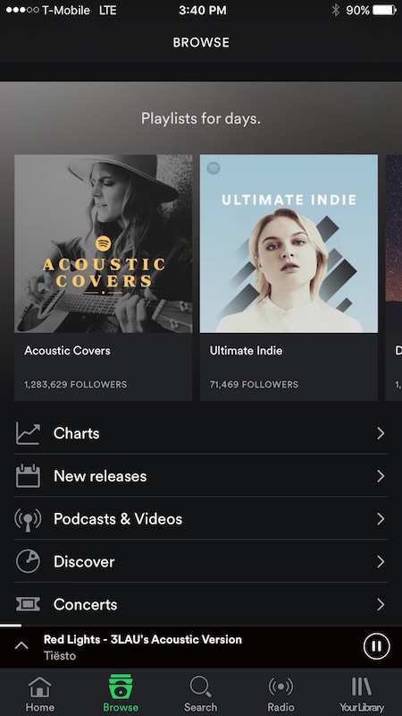
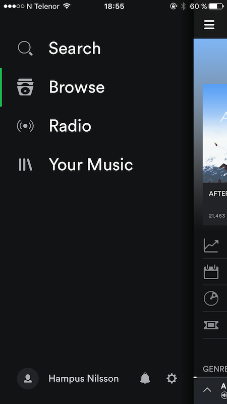
Finally Spotify has rejoiced and removed the dreaded hamburger from their app. I never really understood that choice, since it adds extra steps to all navigation. Take a look on the difference first:
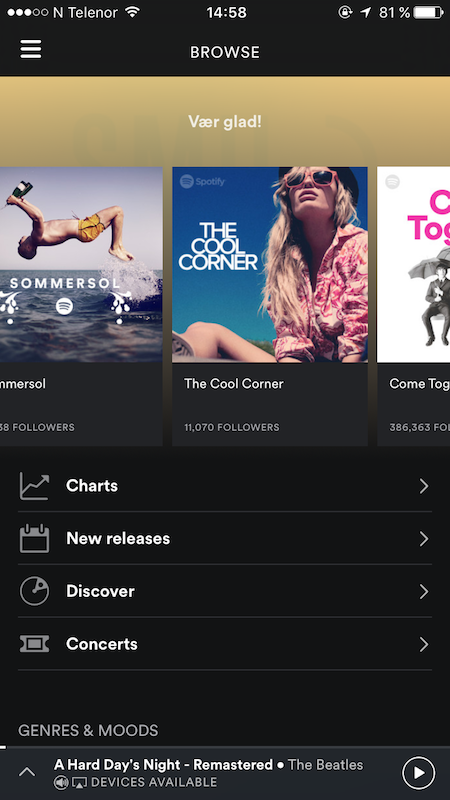
To dive into why the navigation bar is a superior choice. First note that unless you are changing song within the current playlist. You most likely need to navigate to another view to find something else to listen to. With the hamburger menu, this meant you had to reach all the way up in the corner with your fingers (which, believe it or not is an ardous task). After that, in the old interface you were presented with only 4 options. Search, Browse, Radio and Your Music, as seen below.
If I wanted to Search I then need to tap Search as well, and only then do I get the keyboard input. In the new version, the switch only requires a single tap. The same is true for the other options, everything is one tap closer to use, not to mention more discoverable.
Overall, an excellent choice on Spotify’s part. And if you don’t have the new interface yet, it should roll out to people over the coming months.